Self-Inspection tool redesign
Improving the car selling experience for millions of OLX Autos users

TL;DR
When selling a used car, a thorough inspection of its condition is conducted to determine its value and provide an accurate quotation. With OLX's 'Self-Inspection' feature, consumer sellers can easily perform this inspection from the comfort of their homes. The user is asked for necessary data points about the vehicle, and the platform calculates a final selling price for the seller.
Duration
16 weeks
Team
1 UX Designer
2 Developers
1 Product Manager
My Role
-
Conducted user research to uncover pain points in the current design.
-
Explored design concepts to enhance the user experience
-
Iterated on various design solutions
-
Refined the flow's information architecture
-
Created high-fidelity prototypes for user testing
Status
The feature was launched along with the new OLX Autos android application in May 2022
BITE SIZE VERSION
A peek into the redesign
The core of my work involved thorough user research to uncover pain points in the current design, exploring design concepts to improve the form's experience, iterating on various design solutions, refining the flow's information architecture, and creating a high-fidelity prototypes for user testing.
My Role
OLD DESIGN

REDESIGNED SCREENS
Skip to Final Designs
👇🏻

Background of OLX Autos
INTRODUCTION
OLX Autos is one of the 30+ companies owned by the OLX Group and has presence in several countries like India. Mexico, Chile, Argentina, Columbia, Indonesia etc.
OLX Autos is an online Car trading platform. User can sell their Car, buy one from the car listings from the platform or get their purchase financed by OLX. Selling, Buying and Finance are the three verticals OLX Autos deals with. They have Android, iOS as well as Web platforms. This Project fell under the "Selling Vertical".
Understanding the Sellers Experience
Thousands of users visit the OLX stores and digital platforms daily to buy, sell or trade their cars. To enable a smooth trade of cars, it is important to enable sellers to conveniently sell their cars on the OLX Autos platform and then enable buying and other services such as financing, cross-sell, VAS, etc.
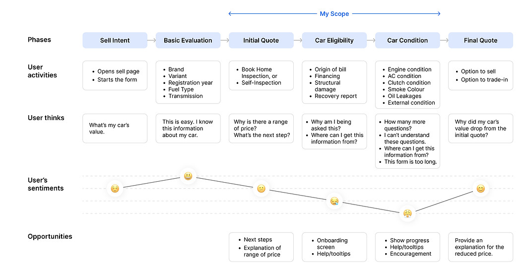
my focus
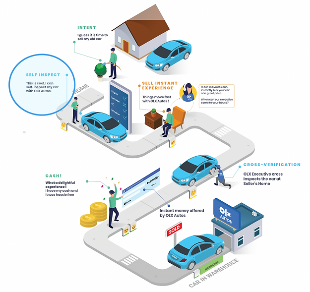
SELL INTENT
SELF INSPECTION
QUOTE
INSTANT PAYMENT
CAR SOLD
Self-Inspection and the "IKEA Effect"
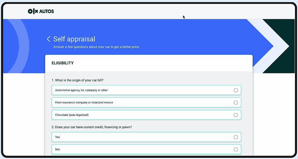
A car is a fairly technical product and therefore, its inspection is a key component in this setting. While selling a used car, a detailed inspection of its conditions is done in order to derive a quotation. In 'Self Inspection', the user is asked for enough data points about the car to help us arrive at a final price for their car.
The IKEA effect is a cognitive bias in which consumers place a disproportionately high value on products they partially built/created. The use of the self-inspection tool will instigate and induce this effect as the users will get involved in the inspection process which is an integral part of the selling experience.

Basic Details

Car Condition

Car Photos

THE CHALLENGE
The current design of the 'Self-Inspection' form has a poor experience and an outdated visual design, causing several issues, including low conversion rates and a high rate of abandonment.
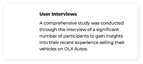
EMPATHIZE
Talking to people


A fast and smooth car inspection experience.


USER NEEDS
BUSINESS NEEDS
Increase conversion rates and reduce user drop-outs.

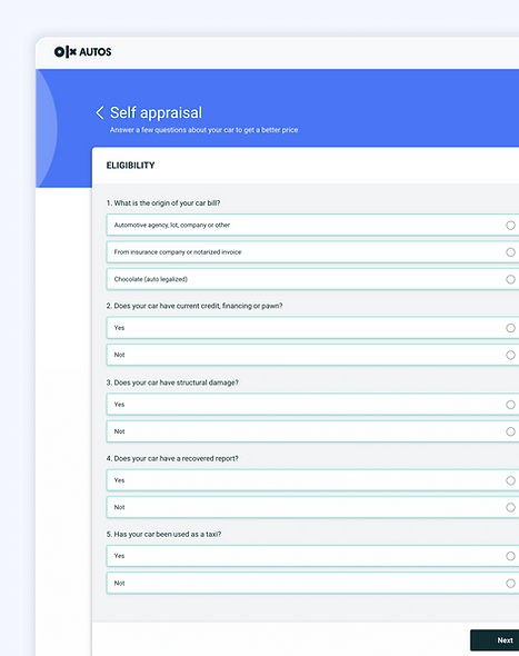
CURRENT DESIGN
Analyzing the current journey


PAIN POINTS
What's wrong with the existing design

Increased cognitive Load
A lengthy and tiresome form with several pieces of information asked on one page is visually exhausting for the user. This extensive procedure can be perceived as time-consuming or tiring for users.

Lack of visibility of status
No indication of progress within the form causes anxiety among users and results in a high rate of abandonment because users are unsure of how many questions remain, leading to a sense of uncertainty.

Excessive Jargon
Unclear sequencing & lack of explanation regarding the form and its questions confuse novice users. Users may encounter technical questions that can prove challenging to answer accurately.

Visual Inconsistency
The current UI design of the form appears outdated, with an aging aesthetic, and violates several heuristic principles. The overall design fails to provide a visually appealing experience.
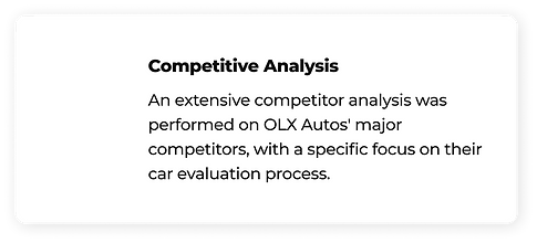
COMPETITIVE ANALYSIS
Screening design opportunities from competitors
Design
Good to learn
A
PWA - Sell Vertical

B

A
Dividing the questions into clear and organized sections for improved readability.
Vertical scrolling instead of pagination increases the speed of navigation.
B
Using simple language for asking questions makes it easier for people to understand.
Simplified technical jargon by breaking down options with clear and relatable examples, makes it easier for novice car owners to understand and make informed choices.

Mobile App - Sell Vertical
A

B

A
Clearly outlining the steps before they begin prepares users for a seamless form-filling experience.
Allowing users to resume their form-filling journey effortlessly from where they left off, promotes convenience and efficiency.
B
Always-visible, horizontally scrollable tabs in the top navigation, provide users with a clear sense of their progress and location within the flow.
Presenting brands through visually recognizable logos, instead of just names, enhances clarity and speeds up the decision-making process.
GOALS
Defining success

.png)


.png)
Product requirements
Achievable
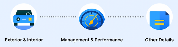
Fragmenting the form into semantic sections for gradual answering.
Obvious
Showing progress and feedbacks to keep users informed about where they are in the flow.
Informative
Concrete steps and documentation throughout the form.
Rewarding
Creating milestones to encourage and reinforce actions with incentives.
Engaging
Transform form into an engaging experiences that encourages users provide their information.
Faster
Using a vertical scroll interaction instead of pagination.
BRAINSTORMING
Initial Iterations
Fragmenting the form into semantic groups using section breaks to give users a feeling of gradual answering.


New flow

HIGH-FIDELITY
Final Designs
# HELP AND DOCUMENTATION
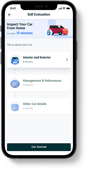
Introductory Screen eases the user into the form
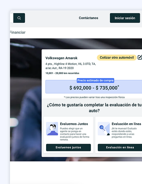
A. Based on the car's basic details, the user is shown a range of quotes. The user is given clear options to choose an online or in-person evaluation.
B. An introductory screen onboards the users about the structure of the form and also informs users about the average time required to fill each section.
A

B
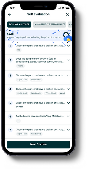
# VISIBILITY OF SYSTEM STATUS
Section-wise form-filling process
A. The introductory banner of each section explains the purpose of the section, which builds trust in the users. The top navigation has tabs that keep the users informed of the stage of the form they are in.
B. On filling in Q1, the question minimizes with an accordion interaction and the next question takes the center stage. The partial visibility of the previous questions informs the user that the screen is scrollable, and that they can go back and forth in order to edit or review answers.
A

B

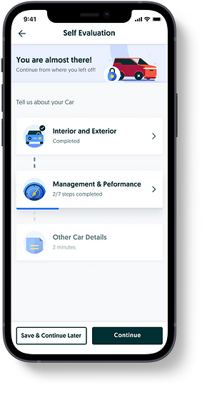
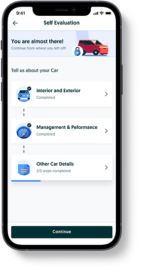
Milestone screens encourages users to continue
A. Celebrating the success of completing a section to encourage the users! This screen gives a sense of accomplishment to users and the continuous communication pushes users to continue and complete the form.
It also helps them in visibility of status of steps.
B. The user can edit the answer to any of the questions by clicking it. The question opens up with an accordion interaction.
A
B

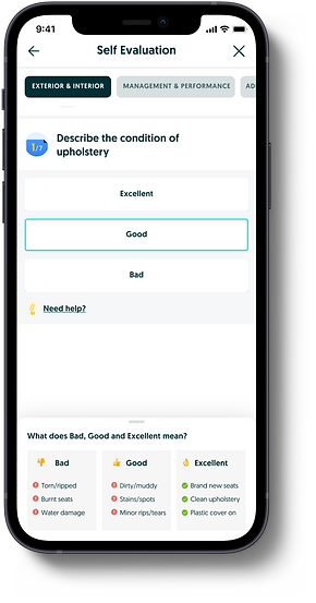
# HELP AND DOCUMENTATION
Providing guidance throughout the Form
Help in terms of tooltips is available for answering technical questions. The tooltip appears in a bottom sheet which does not take up a ton of screen space and can be closed by swiping down.

Nudging users to complete the form
A. When a user tries to leave the form, they are prompted with an encouraging message to continue by visually showing the progress of the form. The user may also opt to save the progress and continue later.
B. A returning user sees the milestone screen where they are reminded of their progress.
A
B
REFLECTIONS
Lessons Learned

Usability will always be important
Experimental design can help with individual and collective creativity, however not all experimental designs are scalable. We need to keep in mind the scalability of a design.

Creative Thinking Solves Problems
This project stretched my ability to think outside of the box. After I finished this project, I was able to find new and different solutions for tricky problems in other projects.
More Projects


